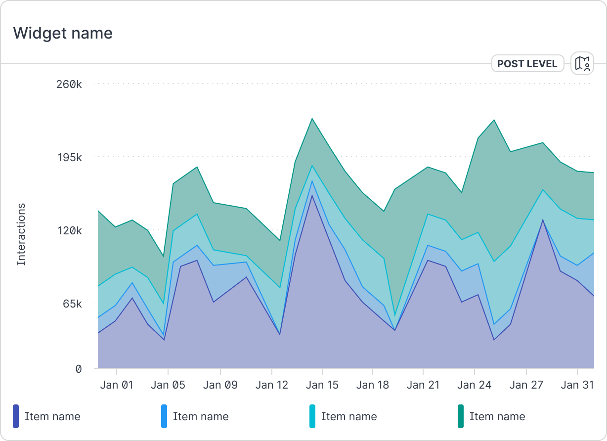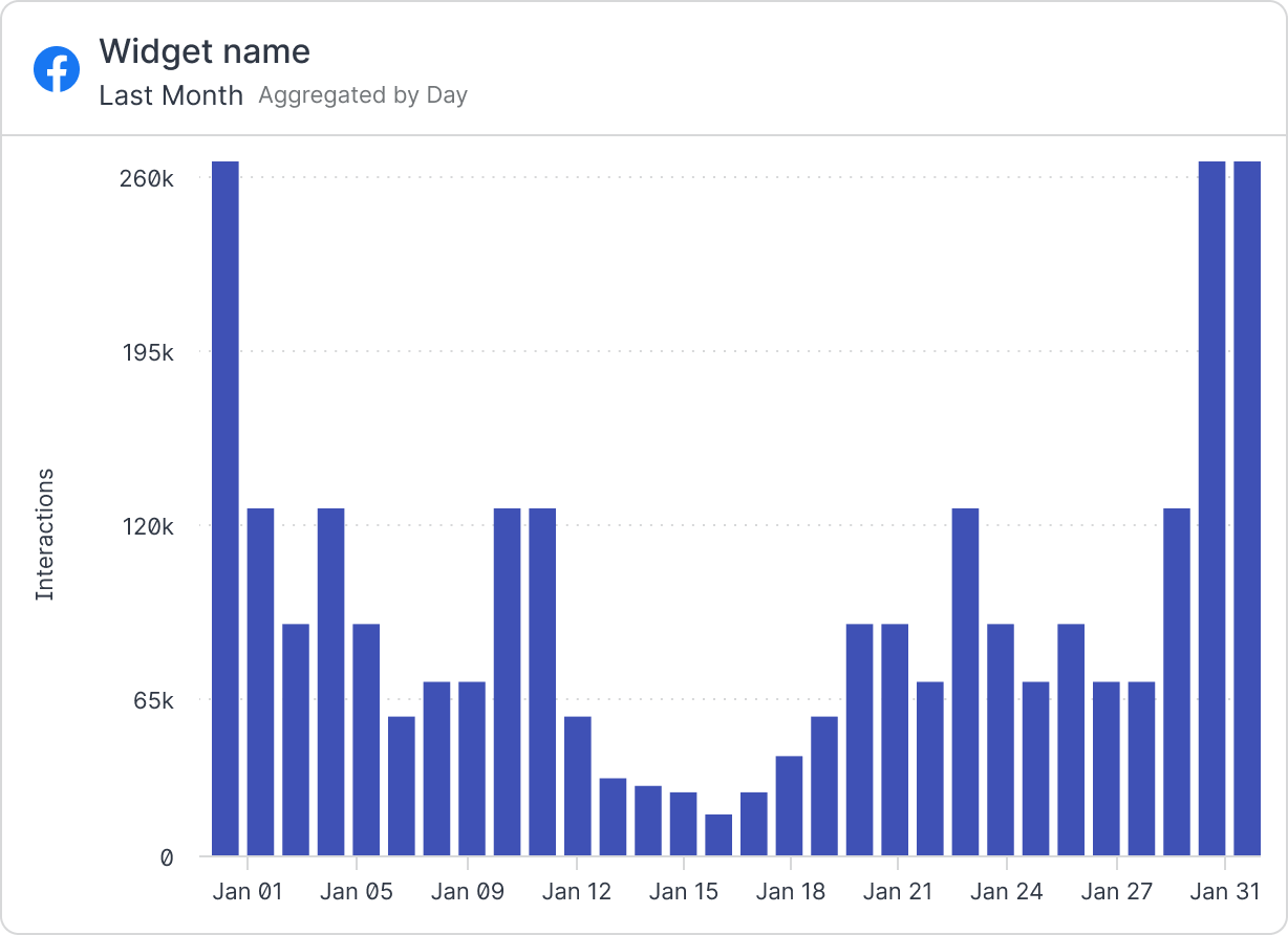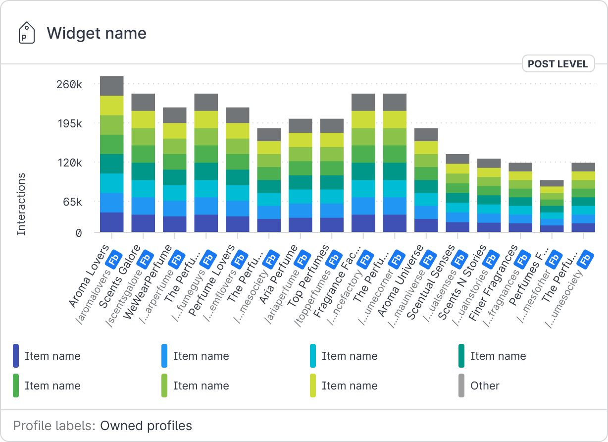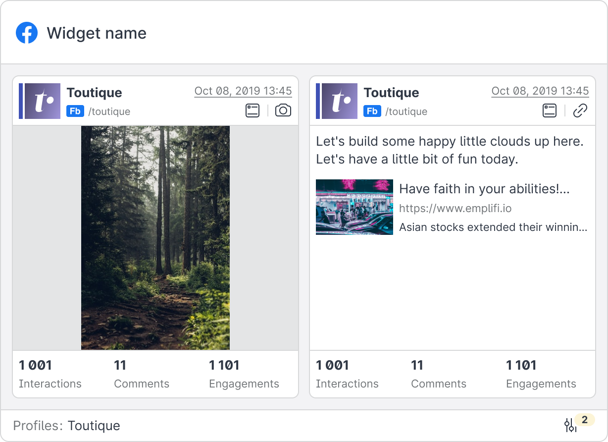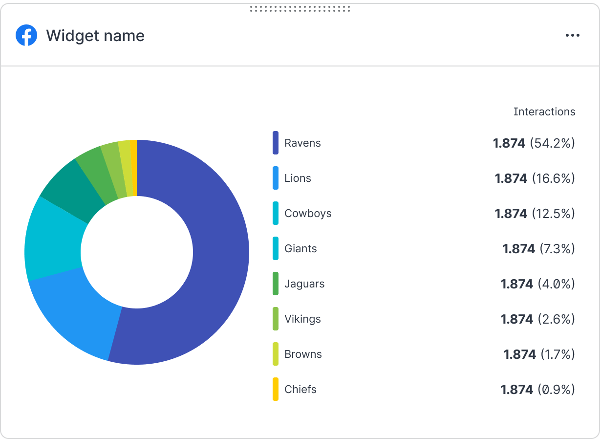

I was inspired to write this article/tutorial about responsive widgets for two reasons. First was the lack of a proper community file in Figma. The second reason is that I work in a company that focuses on showing data to clients, and I have some background experience in this field that I’d like to share.
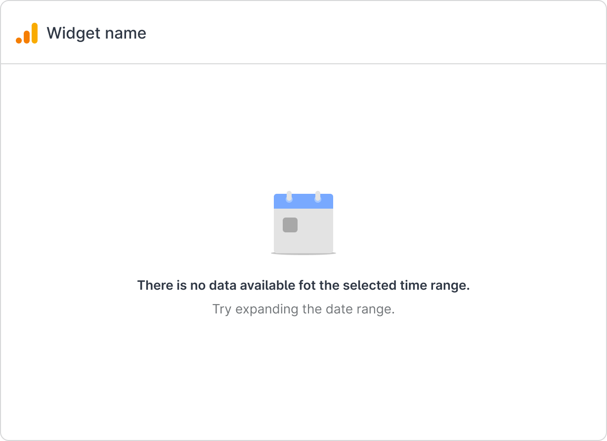
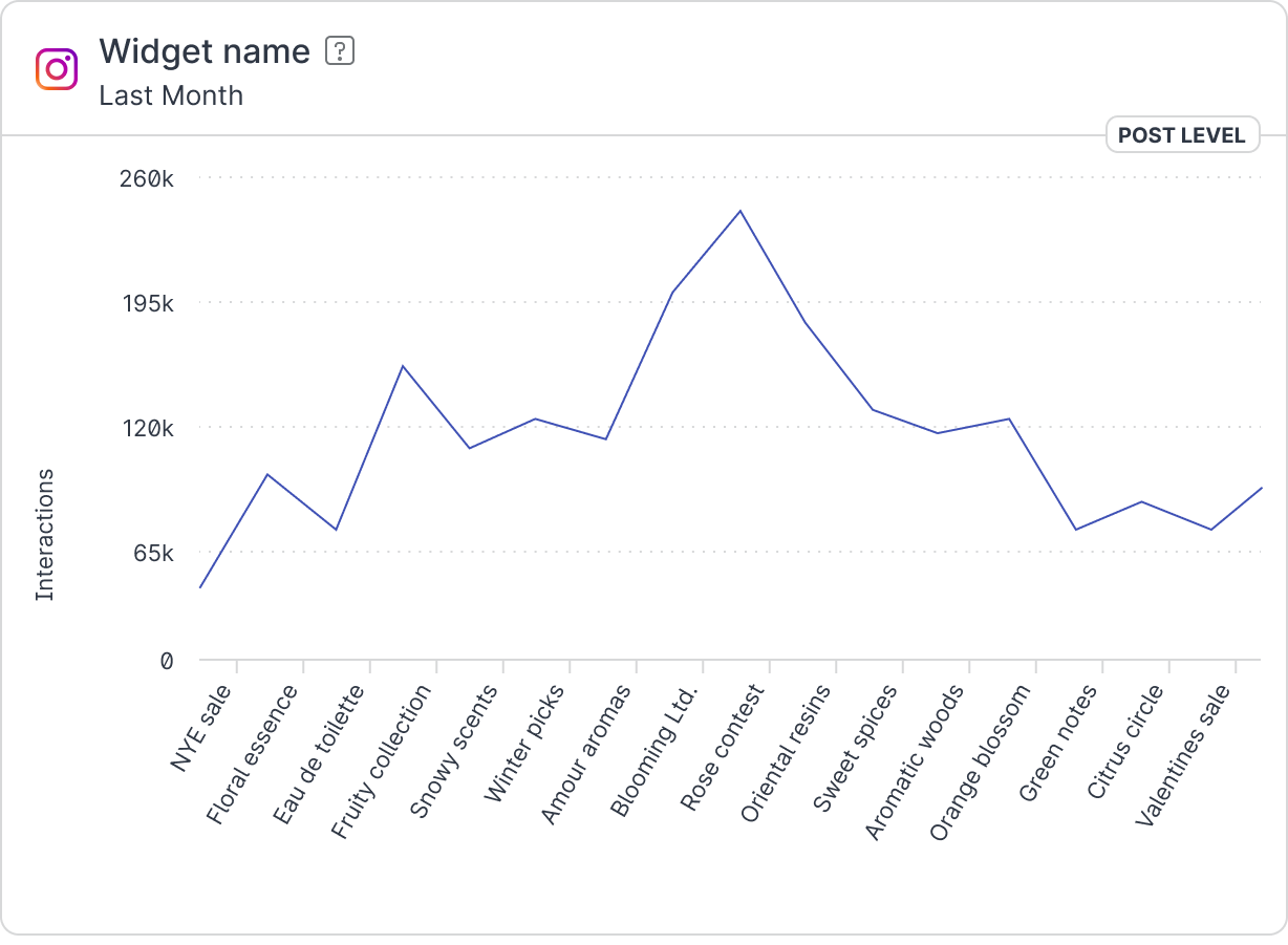
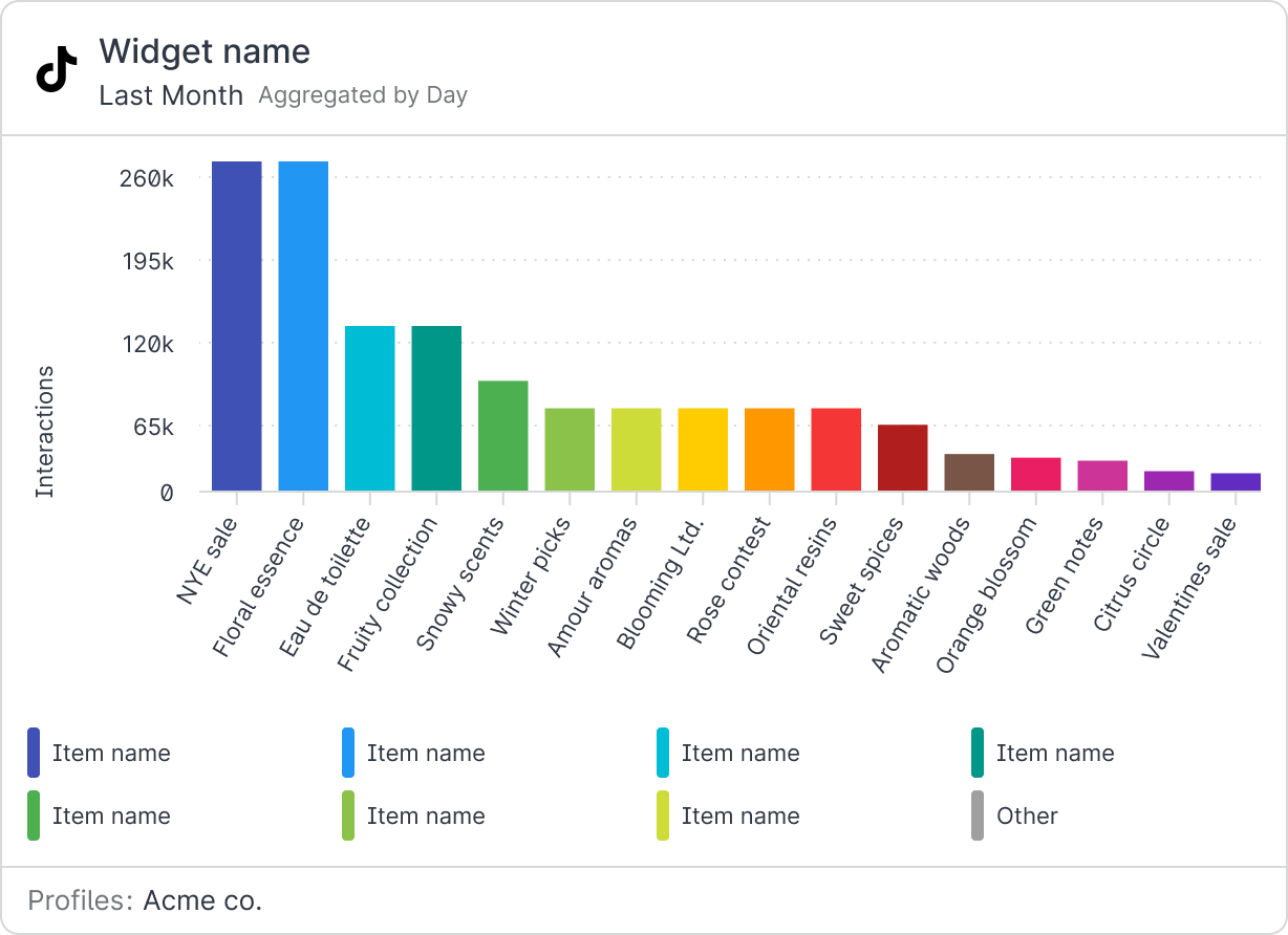
But before we dive in, what do I mean by “widgets”? My definition may look slightly different from yours. At Emplifi, what we call widgets are basically containers for different metrics that process data from users’ social media profiles and visualize it in the form of a chart or graph.
Now that we’ve cleared that up, let me tell you how I revolutionized our old-school widget to make a sexier, more responsive one.
Anatomy
Let’s start by defining widget anatomy, which comprises several parts. (More details can be found in our Figma community file.) One part is the header, which carries information about the widget's origin or on-hover actions. Another part is the visualization (which we will look at in more detail below). Finally, there is the footer, which is optional.
The header and footer are quite clear in the figure below, so there’s not much to write about. But what starts to be interesting are the yellow grouped boxes (i.e. the chart area and chart group).
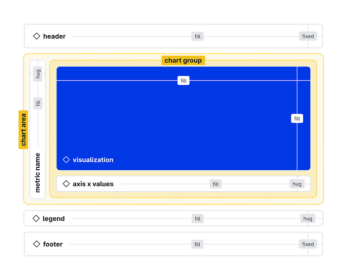
Chart area
As you can see in the figure above, the auto-layout wraps around the metric name and extends the entire height of the box. This approach works because there can be large elements in the x-axis values, and metric names can also be long. The metric name is horizontally centered. The whole chart area is set to fill—fill, to fill the space when any stretching takes place.
Chart group
In the chart group, the auto-layout wraps around the visualization component (chart + y-axis values with supporting guides) and the component for x-axis values. It may seem a bit complicated, and there is a reason for that. The x-axis values need a bit of padding magic to make everything fit as it should. The whole chart group box is set to fill-fill so that it behaves correctly when the width or height changes.
Visualization
Visualizations are the alpha and omega of the whole widget. I went through a lot of pain to get it all properly aligned so it would work responsively. The visualizations involve a separate component that carries both the y-axis values and a separate chart that is embedded in the frame. This frame [chart] has constraints set to (left and right) — (top and bottom) as well as the supporting lines below that, which are resolved by the auto-layout with the same constraints set.
In my final solution, these two groups are not wrapped by auto-layout so that they can be layered on top of each other. Before arriving at this solution, I tried various workarounds via absolute positioning of the chart but never got it to behave correctly.
If you’re lost, use the slot.
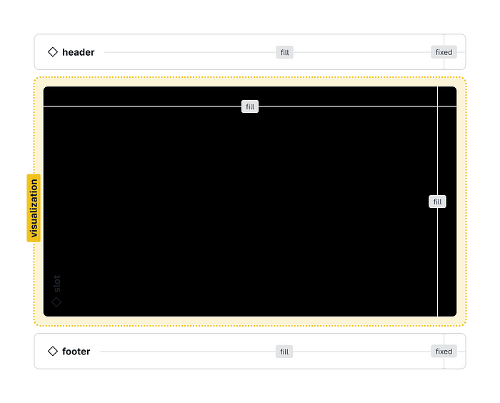
If you have no idea what a slot is, here’s a great article about it (although it refers to slots as “shells” for some reason). To summarize, a slot is a new type of component designed for elements containing dynamic (e.g. responsive) content. Thanks to the placeholder inside of the slot, you can swap it with any component you might need.
Using the slot, you can elegantly solve visualizations like pie charts or tables. You just have to consider it during development and leave the option on the table. Then, every other designer who designs a visualization can just swap it for their own, and the widget’s wrapper will remain the same and synchronized with the design system.
👇
More details and a complete gallery can be found in this flashy Figma community file. Feel free to use it.
PS: As you know, design is never finished; that’s why we’re cookin’ up a fresh batch of widgets and visualizations for y’all. If you don’t want to miss the new version, follow our Figma community page.
Widgets Gallery
