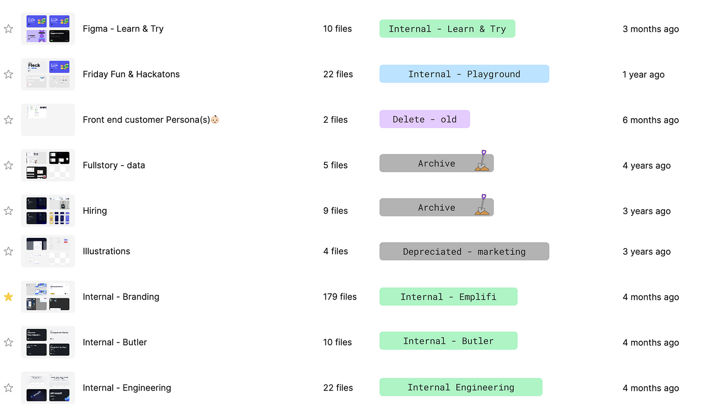

When I first began addressing this issue, we had a total of 107 folders and 2,549 files in our Figma account. Many of these folders served no purpose beyond housing a single file. Working within such a disorganized system was inefficient. It consumed a lot of time, whether when searching for a specific file or finding an appropriate folder to place newly created designs — time that could have been better spent on meaningful tasks.

Upgrading to a higher plan (which would allow us to place folders within folders for easier subdivisions) was not a realistic option for us at the time. We weren’t even sure if upgrading would help us overcome our disorganization problem. Instead, we determined that the most important task was to implement a new set of rules and organizational framework for our Figma files.
Research: Evaluating our Figma workspace
To start, we had to deeply research what our Figma workspace actually contained. This was the only way to assess how many folders were entirely unnecessary, how many could be merged or potentially deleted, or just renamed. For this purpose, I used FigJam to replicate the entire structure with screenshots of our Figma account, which enabled me to make notes about the fate of each folder.
Reorganize: Creating a new system
After evaluating our current setup, the next challenge was to create a new filing system that would not only function 100% of the time, but also remain easily sustainable for the future. It was immediately obvious that grouping folders with similar focuses such as “Product”, “Marketing” and “Research” was the most logical approach.
To improve navigation further, we needed to subdivide each main folder. Since our plan does not allow subfolders, we created a structured folder-naming convention to indicate sub-sections.
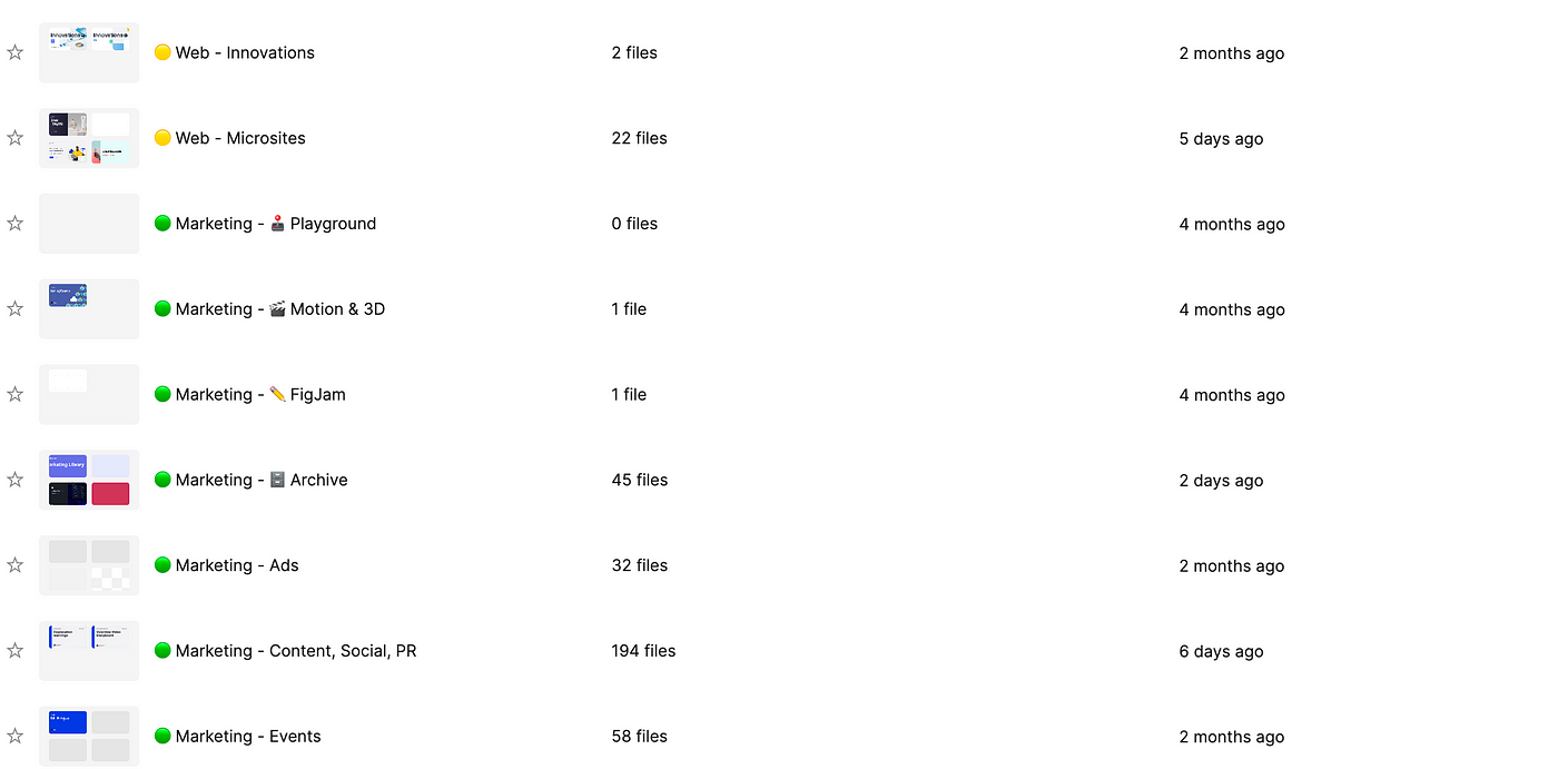
In our solution, the first word in the folder name denotes the umbrella section, while the second word specifies the type of files contained within it. For example, a folder named “Platform — Dashboard” contains all Figma files related to the Dashboard module in the Emplifi platform.
In the end, we created about 10 folders, each with a varying number of files (subsections), and reorganized all 100+ of our existing folders accordingly.

Additionally, we established a file-naming convention that includes the section names in their titles to facilitate searches. We agreed this would apply to new and current files, since retroactively renaming all files was deemed impractical (and frankly, a little crazy!).
Reinforce: Enhancing visual navigation
We didn’t stop at naming conventions. Sure, we now had a new system that worked, was simple, and secure, but something was still missing — a visual aid to enhance navigation. It was my colleague
who proposed differentiating the sections with color bullet emojis (⚫ 🟡 🟣 🔵 ⚪️ 🟢 🟠). This idea proved to be the perfect solution.
Each new folder is now labeled with a colored bullet emoji preceding its name, serving as a visual cue. This color-coding makes it much easier and faster to orient ourselves in the basic root structure when scrolling through sections, as we simply navigate by color instead of reading names.
Here’s another tip: you can set up useful folders that will be present in every section, once again labeled with a respective emoji to maintain their place in the structure. For our purposes, these are:
🕹️ Playground: Here we store our ideas, inspirations, and draft concepts.
🎬 Motion & 3D: This is where we house our storyboards and materials for video and animation creation.
✏️ FigJam: A place to discover, plan, brainstorm, explore, collect feedback, and much more.
🗄️ Archive: Anything outdated or unusable goes here.

Chaos, conquered: A worthwhile challenge
With our filing system and folders in place, the most daunting task remained — relocating 107 folders and 2,549 files to their new destinations.
This process proved to be the most demanding part of the reorganization effort. The effects of five years of random Figma use were evident as we painstakingly opened each folder, reviewed its contents, and relocated it to its new home (or archived it if necessary), and finally renamed it according to our new conventions.
While this required long hours of effort, the resulting organization and efficiency made it undeniably worthwhile. The reward is a Figma environment that is not only more organized, but which also enables increased creativity, productivity, and peace of mind.

If you have more tips on how to improve file structure in Figma, I’d love to hear them. Leave a note in the comments!


